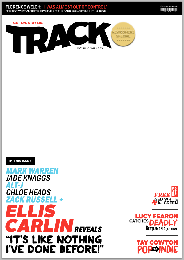
I have gone against my previous designs slightly in order to create a more visually interesting cover through the addition of an extra colour (the light blue). And a varied font use to demonstrate the emotion of the text such as the word 'deadly' is in a scratchy horror style font and important information such as artist names are in a larger font size. I have also made the masthead black to create more contrast to the rest of the text on the page. I have also added some boxed text as this is a common convention of a magazine which has seen an increase in use in the past year and so it suits the current market. The masthead now also has a slogan "get on. stay on." which is a play on phrases containing 'track'. This will increase the strength of marketing for the magazine brand as it is memorable and unique to the magazine.
This is my final layout and all it needs is a photo. Some colours will have to be changed such as black to white and vice versa in order to make it stand out from the photo which will have both highlight and shadow areas.