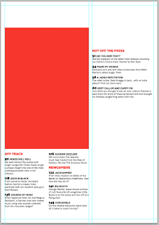
I have decided that the previous contents page design was too simple. By which I mean the text was too large and so it took up too much of the page and looked childish/goofy. There was also too much white space around the edges so that it didn't make the most of the space on the page.
To combat these problems I have made all text 9pt. The titles have stayed 12pt however so that they stand out from the normal text. I have also reduced the guttering and border guides from 1cm to 0.5cm so that it makes more use of the space and I can fit more on. Notice too that I have split the bottom features into 2 columns to make the most of the space and make it visually interesting than just the generic 'list' style top to bottom text.
I have also decided that there should be one large photo on the contents page as this is a convention I have seen in the contents pages of both Q and Vogue and I think it works well to visually demonstrate that this is the main feature. This is the reason that the left column is now wider than the right to accommodate this photo.
I then put the descriptions for the features on the cover onto the red photo box under the title 'Cover Stories' this is a convention of many magazines. I put the page number and title of the main feature that the photo will be of in the corner so it doesn't obstruct the photo.
I then brought back the band photo of 'Level X' and the newcomers badge and put them in the new smaller right column. I removed the black border as I thought this made the photo feel claustrophobic. I then as with the main large photo, put the page number and title in the bottom corner so not to obstruct the photo. I also brought back in the description text but removed the surrounding black box as this made the page look cluttered and messy. I then introduced a large quote underneath the photo. This entices the reader to read on to see what the quote means. It is large to fill the whitespace and catch the readers eye. I used a mask to fill the text shape with the photo of the band and then applied a blur to make the texture less distracting.


