Pages

19 Jan 2016

Contents Page Image Edit


This is the original photo I chose to be the photo of my band on the contents page.
I first started by making the yellow brick wall background greyscale. This was both because the yellow does not suit the colour palette of my magazine and also makes the models blend into the backdrop slightly. I did this by using a hue/saturation adjustment layer.


As this made the entire image greyscale I then added a mask to the adjustment layer and painted with a black brush over the models on the mask layer, this excludes the painted area from the greyscale adjustment layer and brings them back into colour.

I then added a second saturation adjustment layer and decreased it only slightly so that the colour was depleted but not completely removed. This gives the image an edgy, cold effect perfect for the sombre image of the band. I then copied the mask layer from the greyscale background onto this layer and inverted it using Ctrl+I so that rather than the models being excluded from the saturation adjustment, the background was.

I then increased the exposure on the image to bring the models into light and make their silhouettes stronger as it increases the highlights but leaves the strong shadows intact.

I then made a drastic edit with the addition of black lipstick. I did this by making a new layer on top of everything and painting over the shape of the models lips using a black-purple colour eye-dropped from the models hair so that it blends in colour-wise with the photo. I then changed the blend mode of this layer to Multiply.


This blending mode works by multiplying the luminance levels of the current layer’s pixels with the pixels in the layers below, creating an darkening effect whilst maintaining the original image information underneath as if transparent. I then blurred the layer to make the edges of the edit more seamless and realistic.

Double Page Article Text

You might remember this guitar prodigy from his stint as nephew Jack Saphone in long running British musical sitcom ‘Halcyon Days’ but some may not know of his impressive pop-punk discography. Now 5 years on from the release of his debut album ‘Help’ with short-lived teen band ‘Glass Heart’, White is now back with a new band, ‘Dead Gorgeous’ after a disagreement with the band over alleged drug allegations left him in financial and social turmoil. He now wants to put the past behind him and focus on his greatest love- indie music.We caught up with Ged earlier this week when he popped into Track to promote his upcoming single ‘Thirst Place" available online and in stores from Monday.

CHILDHOOD
Well what’s to say, I had a fairly comfy upbringing, my mother was a lawyer and my father was a civil servant. "We didn’t have the most money, but we got by. "Still, that’s not important, I was like any other kid at that time. All I’ve ever wanted my whole life was to be a performer, I remember when I was 5 years old my mum bought me my first toy guitar. Flimsy little plywood thing with plastic strings, made an awful twanging noise, but I didn’t mind. As far as I was convinced I was Britain’s answer to Jimi Hendrix. I’d made up my mind, I was gonna be the greatest rock star who ever lived. But gradually I started to realise ‘oh, this is awful! I need a real guitar. I need to make real music.’ So at 10 I had my first lessons and of course, my first real guitar- a Fender Stratocaster. Needless to say I’m a bit better now, and being solo is really giving me a chance to develop my skills. I still play on that guitar sometimes actually, a lot of good memories there.

STYLE INSPIRATION
"I’d never really taken much care with my clothing choices." It wasn’t until about 3 years ago I really got into clothes. I left school at 17 and started copying a guy who I used to see on the bus into town every day; Nick, I think his name was. He was like, the coolest guy I’d ever seen. He wore real Italian leather jackets and vintage shirts with black skinny jeans, bandanas and baggy beanies. I think that’s very much in fashion now, it’s the London look. But for him to be dressed like that back then, he was before his time. He used to wear his hair in a bouffanted quiff that he had spiked up at the back. I’ve dressed like that ever since.

RELATIONSHIPS
I met the love of my life Ramona last year at a gig I was doing in Bornmouth for the Lemonaid Festival and I’ve never looked back. She was working as a waitress in the cocktail bar round the side of the venue. She brought me over my drink and right there and then I knew she was the one for me, her long dark hair flowing over her shoulders, that coy smile. We’re getting married next week and we’re in talks about doing an album together; that should be interesting.

THE FUTURE
"There are more important things to life than music."
Of course I’m going to carry on making music [laughs]. It’s all I’ve ever wanted to do, but there comes a point in an artist’s career where they need to get out and do someting a bit different- something new. I think the next logical step for me would be to get back into acting where it all started for me. I’ve been offered loads of parts ever since the Halcyon days but they’ve all been the same kind of roles from the same kinds of producers. I get typecast quite a lot, they’re always wanting me to be the ‘teen hearthrob’ or the ‘quirky friend’. I mean looks can only get you so far and don’t get me wrong I’ve enjoyed being that person for a while but just for once I’d like to play something a little different. Like a flawed hero- or even the villain. I haven’t had a chance to express that darker side of myself as much as I can in the music business. Personally I’ve always fancied, if they were to do a live action Aladdin, being Jafar. Actually [laughs] I hear they’re looking for a new Bond. Move over Danny! If all else fails I could probably take a break, you know, a lot of these major artists- not naming any names- have decided to just kick back a bit in terms of their music and I don’t think that’s too bad an idea. It gives you time to refresh, it can get a bit tiring performing the same songs day in day out. I need to get out and live my life so I have something to write about.

15 Jan 2016

Contents Page Photo

Front Cover Development


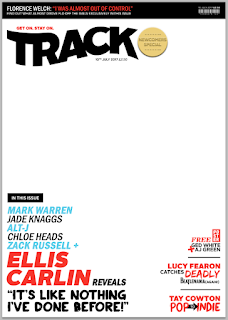
I have gone against my previous designs slightly in order to create a more visually interesting cover through the addition of an extra colour (the light blue). And a varied font use to demonstrate the emotion of the text such as the word 'deadly' is in a scratchy horror style font and important information such as artist names are in a larger font size. I have also made the masthead black to create more contrast to the rest of the text on the page. I have also added some boxed text as this is a common convention of a magazine which has seen an increase in use in the past year and so it suits the current market. The masthead now also has a slogan "get on. stay on." which is a play on phrases containing 'track'. This will increase the strength of marketing for the magazine brand as it is memorable and unique to the magazine.

This is my final layout and all it needs is a photo. Some colours will have to be changed such as black to white and vice versa in order to make it stand out from the photo which will have both highlight and shadow areas.

12 Jan 2016

Contents Page Development

Contents Page Development


I added some bottom text which tells the reader the website where they can subscribe to the magazine, this is a common convention of Q magazine in particular. I also added the page number and date.

Contents Page Development


I reintroduced the masthead however this time the magazine logo takes up much more space to reinforce the brand and fill the remaining space. I also added text which tells the reader that this is the contents and the release date of the magazine.

Contents Page Development


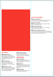
I have decided that the previous contents page design was too simple. By which I mean the text was too large and so it took up too much of the page and looked childish/goofy. There was also too much white space around the edges so that it didn't make the most of the space on the page.
To combat these problems I have made all text 9pt. The titles have stayed 12pt however so that they stand out from the normal text. I have also reduced the guttering and border guides from 1cm to 0.5cm so that it makes more use of the space and I can fit more on. Notice too that I have split the bottom features into 2 columns to make the most of the space and make it visually interesting than just the generic 'list' style top to bottom text.


 I have also decided that there should be one large photo on the contents page as this is a convention I have seen in the contents pages of both Q and Vogue and I think it works well to visually demonstrate that this is the main feature. This is the reason that the left column is now wider than the right to accommodate this photo.


I then put the descriptions for the features on the cover onto the red photo box under the title 'Cover Stories' this is a convention of many magazines. I put the page number and title of the main feature that the photo will be of in the corner so it doesn't obstruct the photo.


I then brought back the band photo of 'Level X' and the newcomers badge and put them in the new smaller right column. I removed the black border as I thought this made the photo feel claustrophobic. I then as with the main large photo, put the page number and title in the bottom corner so not to obstruct the photo. I also brought back in the description text but removed the surrounding black box as this made the page look cluttered and messy. I then introduced a large quote underneath the photo. This entices the reader to read on to see what the quote means. It is large to fill the whitespace and catch the readers eye. I used a mask to fill the text shape with the photo of the band and then applied a blur to make the texture less distracting.